Simplifying Finance Through Website Experience Design

UX Designer
2 Weeks
The Challenge
The challenge was to design a clear, conversion-focused website experience that simplifies eligibility and builds user confidence. One that simplified business rules while remaining accurate, accessible, and trustworthy.
This required:
Applicants needed a faster way to assess their qualifications before applying
Translating eligibility criteria into a clear, step-by-step flow
Designing an experience that builds confidence and reduces uncertainty
Supporting self-service without sacrificing clarity or compliance
The solution needed to be easy to understand, easy to maintain, and suitable for a public-facing finance product.
02: Problem
The Problem
The project focused on rethinking the website as the primary entry point for applicants, ensuring users could quickly understand the scheme, assess eligibility, and take action.
Potential applicants needed a clear way to understand whether they qualified for the Growth Finance Scheme before committing time to an application. Without a guided experience, eligibility decisions were complex, time-consuming, and often required manual support.
The absence of a structured, self-service approach created uncertainty early in the journey and increased reliance on support teams for basic qualification questions.
03: Research
Discovery and Design Methods
Research + Insight:
Conducted a review of analytics to identify high bounce/spend pages.
Mapped out the eligibility criteria and user paths to understand where users dropped off.
Interviewed internal stakeholders (scheme administrators) to clarify common user questions and pain points.
Design + Implementation:
Created simplified content to distil the eligibility criteria into digestible, plain-language steps.
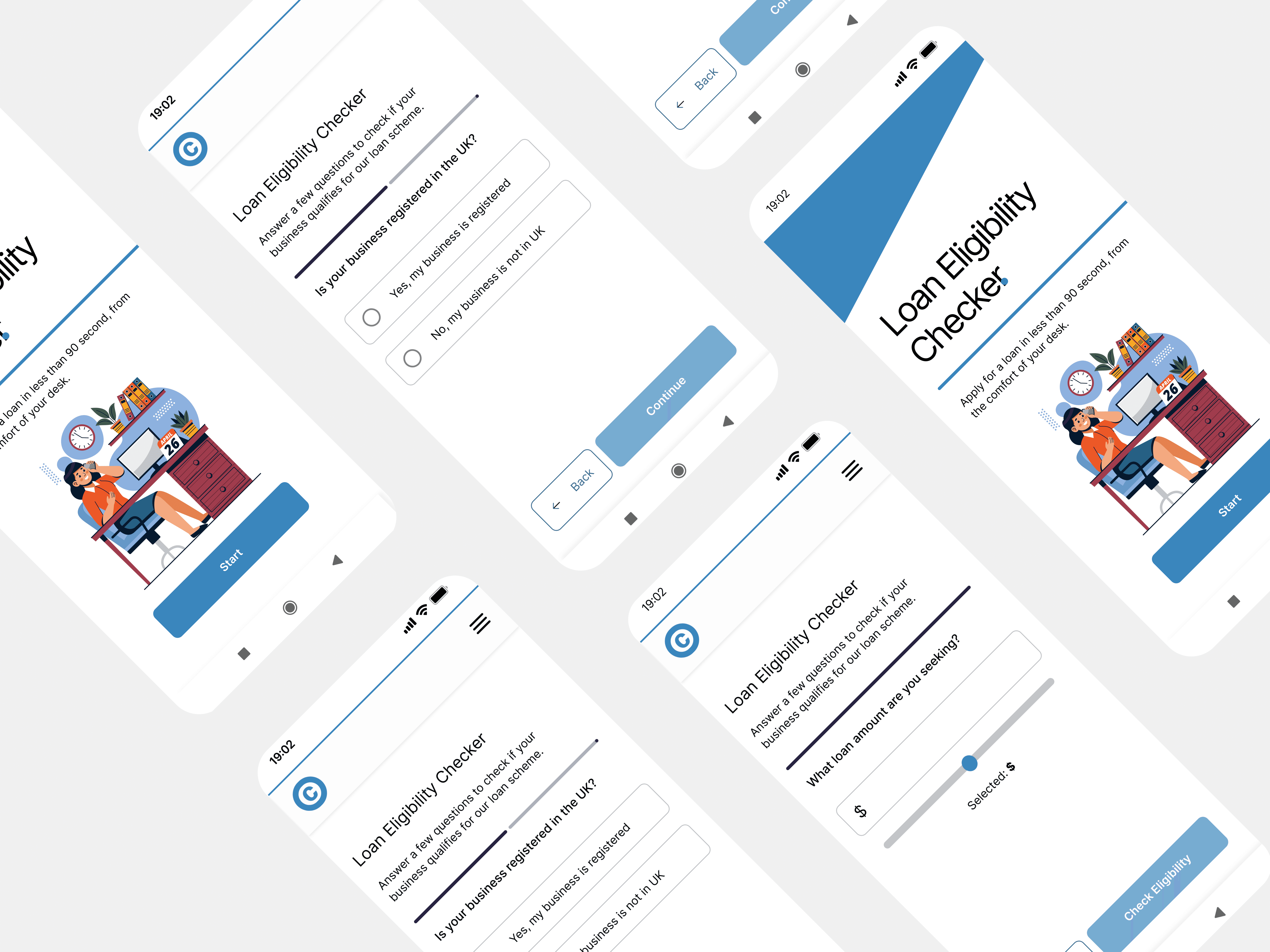
Developed a responsive eligibility-checker wizard: users answer a few key questions and receive immediate feedback.
Applied a visual refresh: updated branding colours, consistent typography, clear call-to-actions (CTAs), and improved layout for readability.
Ensured mobile optimisation, accessibility compliance (WCAG AA), and performance improvements.
Built the eligibility checker using front-end technologies (JavaScript/HTML/CSS) embedded into the site so that results are real-time and no extra login is required.
Key Website Enhancements:
Eligibility Wizard: Step-by-step question flow that ends with a simple “You are/are not eligible” summary and next-steps link.
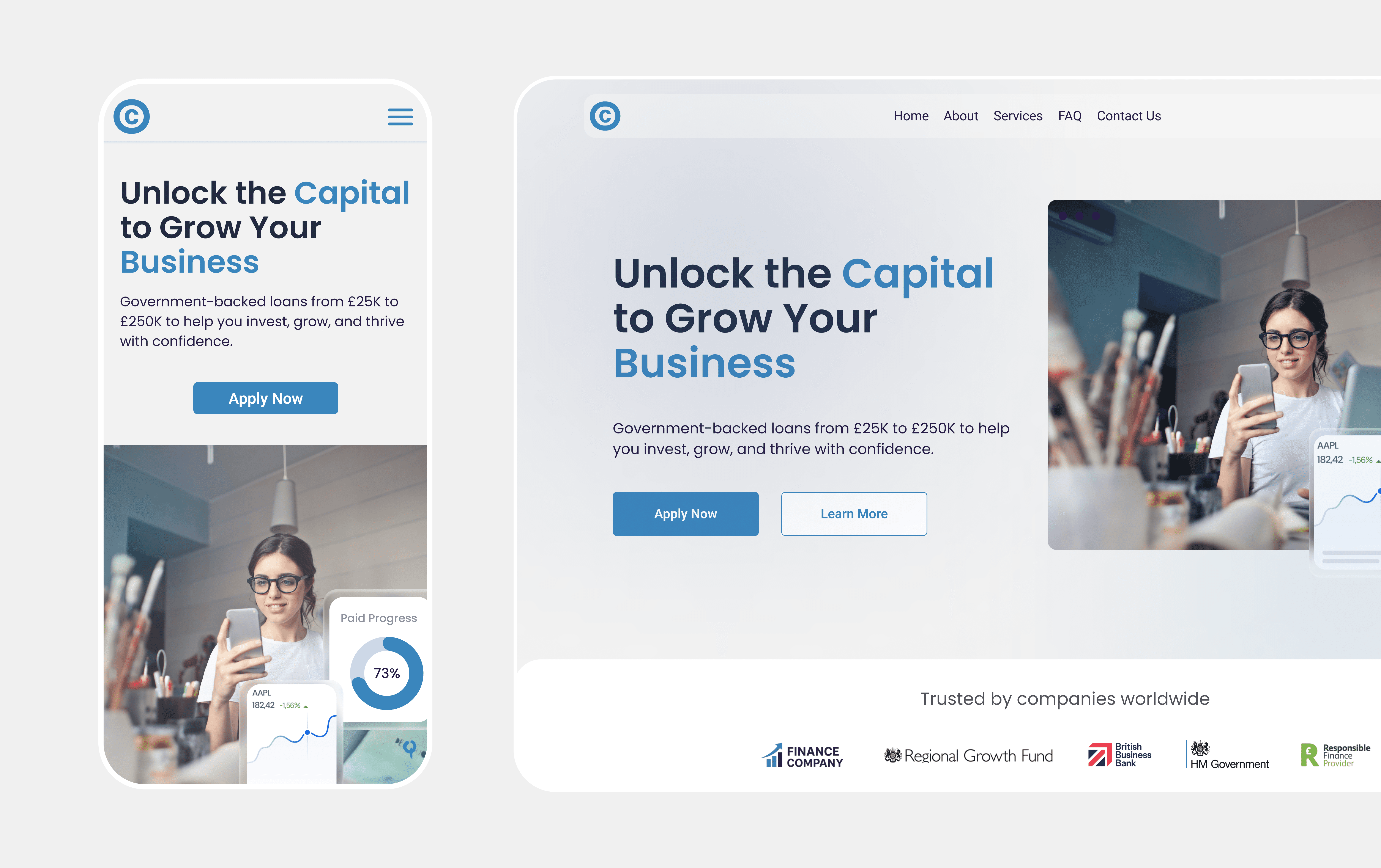
Clear Benefit Highlighting: Visual cards on the homepage summarise the scheme’s value, making the advantage visually obvious.
Improved Navigation: Dedicated “Am I Eligible?” menu item, making the checker highly discoverable.
Performance Optimisation: Reduced load times by streamlining assets and using lazy-loading for non-critical elements.
04: The Solution
Final Delivery
I redesigned the website experience to prioritise clarity, guidance, and conversion, with the eligibility checker acting as a key interactive component within the journey.
The experience is structured as a short, progressive flow that communicates progress, reduces cognitive load, and allows users to review or update answers at any point. Plain-language content and consistent interaction patterns help users move through the process with confidence.
The broader site structure was designed to support this journey, with clear navigation, prominent entry points to the eligibility checker, and concise benefit summaries that explain the value of the scheme upfront.
The solution was designed to be responsive and accessible, with performance and usability considered from the start.